The Client
Page the Cleaner started in 1935 with a motorcycle, a sidecar, and a promise to do the job right. Ninety years later, that promise has carried it through the Depression, a world war, three generations of employees, and a neon sign that became part of Edmonton’s skyline. Page came to ANVL approaching its 90th anniversary, a business with more heritage than almost any brand in the province and a story most of its customers only half knew.
The Problem
Ninety years builds enormous trust. It also builds clutter. Page had decades of strong visuals, taglines, and touchpoints, but they had stopped speaking with one voice. The brand felt disjointed, its nostalgia powerful but unfocused. This wasn’t a case for reinvention. Throw out ninety years of equity and you throw out the very thing that makes Page, Page. The job was to sharpen what was already there without losing an ounce of what built it.
- Industry
- Consumer Services
- Year
- 2025
- Services
- Brand Strategy, Brand Identity, Brand Activation, Marketing


The Thinking
The heritage wasn’t baggage. It was the asset. The people who grew up seeing Page trucks on the road, whose grandparents had their wedding clothes cleaned there, already believed in the brand. They just needed to be reminded, and a new generation needed a reason to feel the same way. So we anchored the work in a single idea: Fits for Life. It speaks to outfits, to clothing that lasts, to expert tailoring, to a stand against fast fashion, and to a relationship with customers meant to last a lifetime. One line, carrying ninety years in both directions.


Quote
"The heritage wasn't something to move past. It was the whole point."


The Work
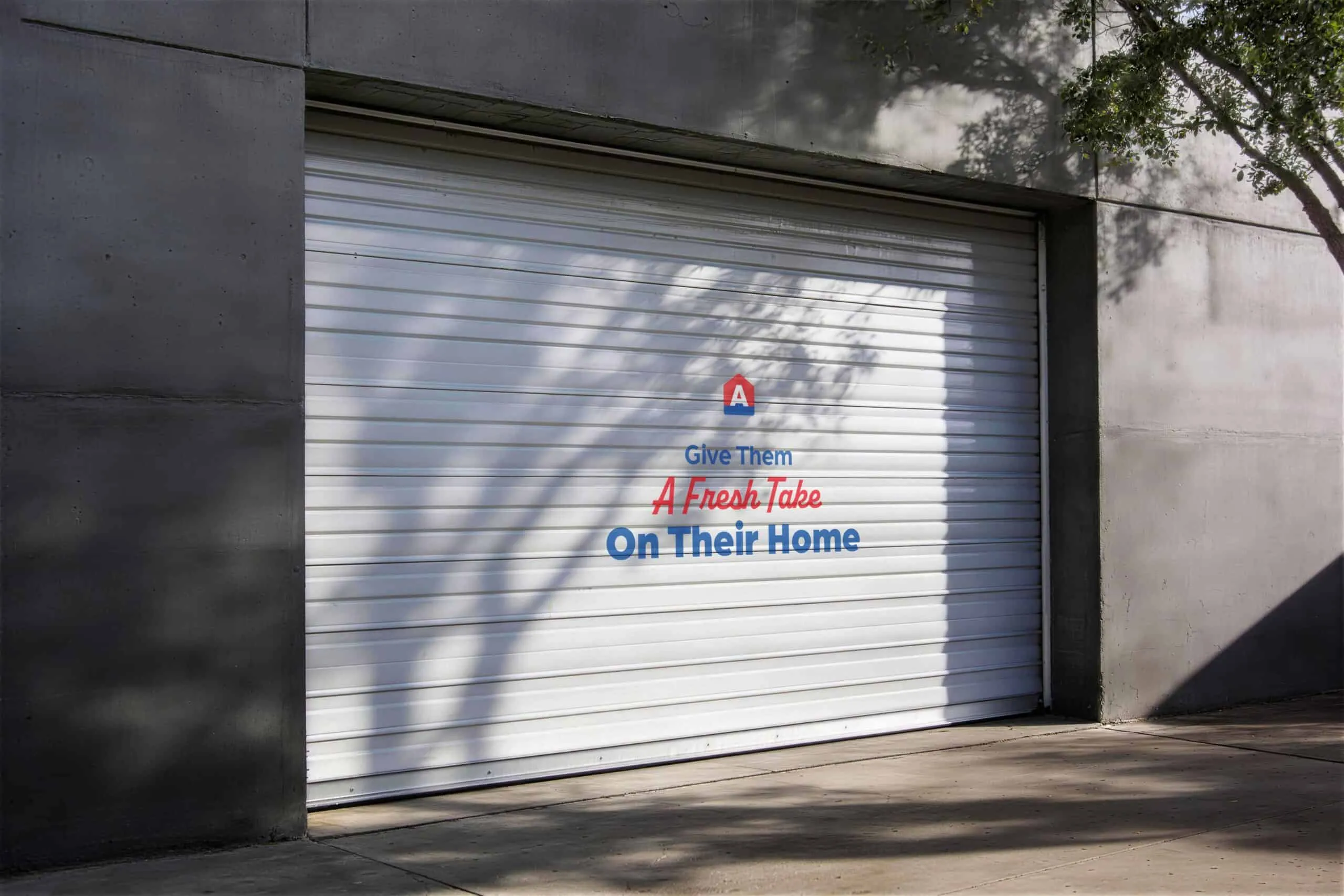
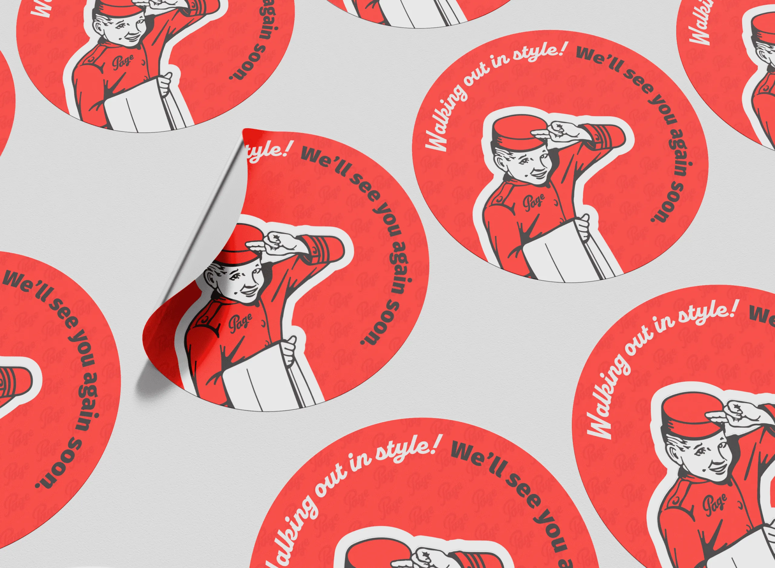
We refined the identity, cleaning up the script wordmark and sharpening the palette so the brand felt modern without surrendering its nostalgia. Then we brought it into the real world. We activated the brick-and-mortar locations with environmental touchpoints that turned a routine visit into a brand experience: heritage walls, service messaging, fitting-room moments, the Page pattern woven through the space. Alongside it, a nine-month 90th anniversary campaign told the brand’s story across LinkedIn, press, and the community. Long-serving employees, the iconic neon sign, the move from paper tickets to text. Every touchpoint was built to do two things at once: help loyal customers relive the Page they grew up with, and give new ones a reason to trust it.
The Result
The relaunch landed. Within a single quarter, Page saw its largest revenue jump in eight years. Loyal customers finally saw a brand that matched what they had always believed about it, and a new generation got their first reason to walk through the door. Ninety years in, Page proved a heritage brand doesn’t fade. It deepens.