The Client
Alberta Carpet & Furnace Cleaning has been in Edmonton homes since 1981. Four decades earned them the trusted-neighbour position: the safe, familiar choice for families who care more about who walks through the door than what it costs. They came to ANVL to modernize the brand, and the instinct was right. The trust was real. The identity no longer matched the company that had built it.
The Problem
The brief was “update the look.” The real issue was that the look was undercutting the business in two specific ways. The typography was italic and dated, so on a truck or an ad it read as budget and speed, the opposite of the careful, quality-driven reputation the company actually had. And the two divisions shared a near-identical logo, so most customers never registered that carpet and furnace cleaning were two separate services. The company was being hired for half of what it could do. Left alone, the gap only widens. A dated mark reads older every year, and a market crowding with franchises and apps doesn’t wait.
- Industry
- Home Services
- Year
- 2026
- Services
- Brand Strategy, Brand Identity


The Thinking
The legacy was the asset and the liability at once. Everything that made the brand valuable, the recognition, the trust, the forty years, lived in the parts a redesign usually throws out: the colours, the prominence of “Alberta,” the horizontal lines people already tied to the trucks. So the work wasn’t reinvention. It was clarification. “Trusted neighbour” was never a position to invent. It was already true. The brand just couldn’t say it clearly. Un-italicize the type and it stops sounding like a discount. Frame the two services and customers finally see both. Keep the colours and nobody feels the brand they trust was taken from them.


Quote
"The trust was already earned. The brand just couldn't say it out loud."


The Work
Every decision either protected equity or fixed a signal fighting the positioning.
The typeface was modernized and set upright, with the key elements in title case. Dropping the italic moved the brand away from budget-and-speed toward something warmer and quality-driven, the way a neighbour reads, not a discounter. “Alberta” kept its place as the largest element, holding the recognition intact. The horizontal lines, already part of the brand’s memory, were repurposed to frame and separate the services, so Carpet and Furnace finally read as two distinct offerings under one name. The core blue and red stayed, so the new system lands as continuity, not a reset.
Beyond the mark, we built the asset library the old brand never had. Two custom patterns carry the two services: horizontal waves for the airflow and heat of furnace work, vertical twists drawn from carpet fibre seen up close, woven and soft. Both give the marketing depth and flexibility a flat logo can’t. The whole system sits on an explicit brand platform, the trusted-neighbour promise and its pillars, so the team has something to build from for years, not just a new logo.
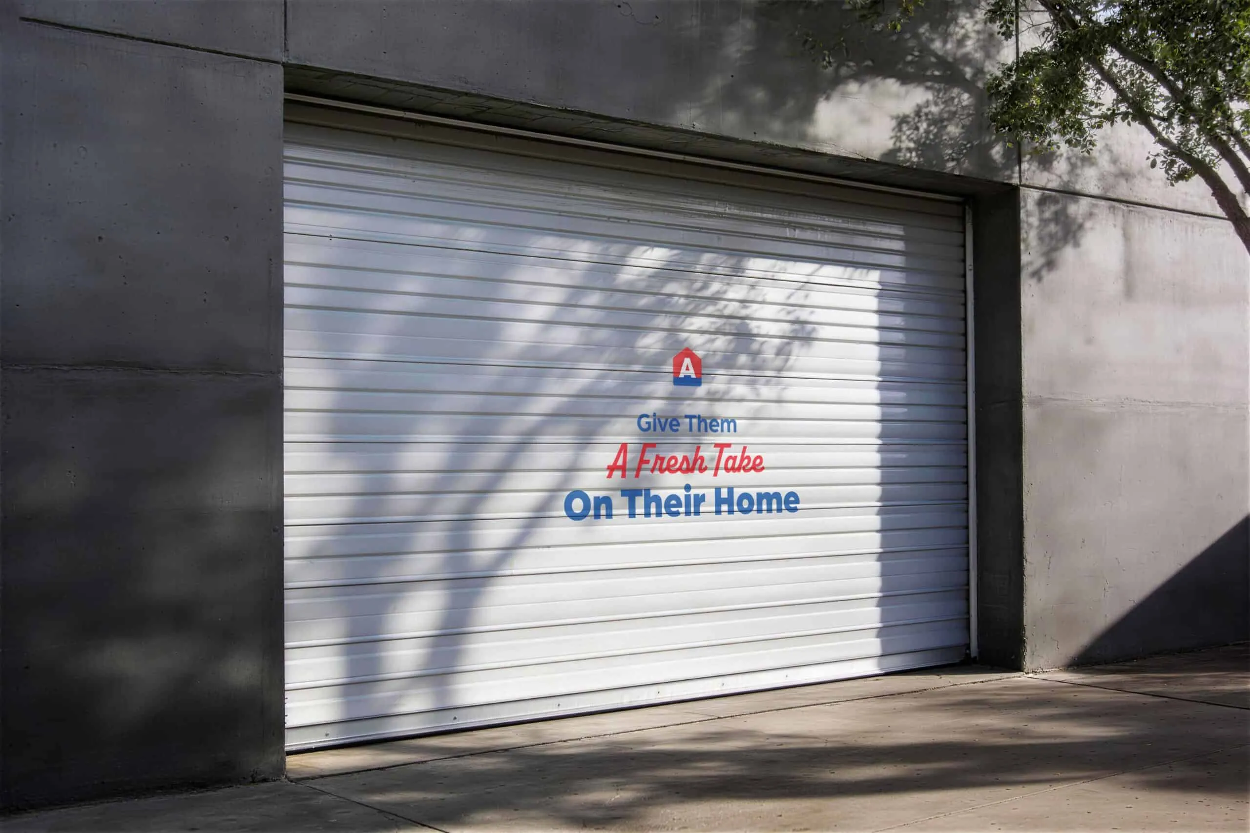
The evolution is now moving off the page and into the building. We’re developing brand activations for the office and the warehouse, turning the spaces the team works in every day into part of the brand itself. The logic follows the strategy: the people are the trusted neighbours, so the brand should be something they live in, not just something printed on a truck. The closer the staff and the customers who pass through are to the brand day to day, the more “trusted neighbour” stops being a line and starts being the way the place actually feels.
The Result
The brand now reads as the company it always was: the quality-driven trusted neighbour, not a budget operator chasing one-off jobs. The two services are legible as two services, which opens the cross-sell the old matching logos quietly closed. And the system holds up where it has to, as sharp on the side of a van at a glance as it is in a digital ad.
The trust was always there. Now you can see it in a second, from across the street.